Introducing v2.2.0 🚀
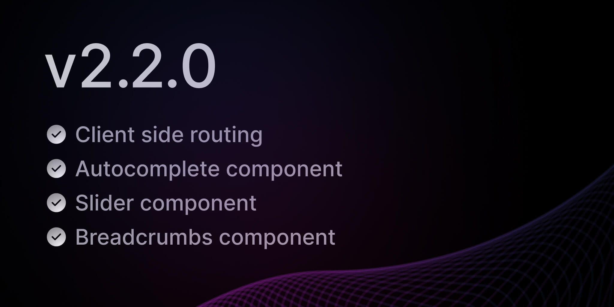
We are excited to announce the latest update to NextUI, version 2.2.0! This release introduces 3 new components, support for client-side routing, and more.
What's New in v2.2.0?
- Client Side Routing - Allows you to seamlessly incorporate client-side routers.
- Autocomplete - Combines a text input with a listbox, allowing users to filter a list of options.
- Slider - Allows users to make selections from a range of values.
- Breadcrumbs - Displays a hierarchy of links to the current page or resource in an application.
- Other Changes - Includes styling improvements, accessibility and usability enhancements.
Client Side Routing
By default, links perform native browser navigation when they are interacted with. However, many apps and frameworks use client side routers to avoid a full page reload when navigating between pages.
NextUI now natively supports client-side routing in components such as Link, Tabs, Breadcrumbs, Listbox, Dropdown and many others offering the flexibility to be rendered as HTML links, allowing you to seamlessly incorporate client-side routers. See the Routing guide to learn how it set it up in your app.
The NextUIProvider component configures all NextUI components within it to navigate using the
client side router you provide.
Note: Client side routing is based on React Aria Routing.
Next.js Example
-
App Router
Go to your
app/providers.tsxorapp/providers.jsx(create it if it doesn't exist) and add theuseRouterhook fromnext/navigation, it returns a router object that can be used to perform navigation.// app/providers.tsx"use client";import {NextUIProvider} from "@nextui-org/react";export function Providers({children}: {children: React.ReactNode}) {const router = useRouter();return <NextUIProvider navigate={router.push}>{children}</NextUIProvider>;} -
Pages Router
Go to pages
/_app.jsorpages/_app.tsx(create it if it doesn't exist) and add theuseRouterhook fromnext/router, it returns a router object that can be used to perform navigation.// pages/_app.tsximport type {AppProps} from "next/app";import {useRouter} from "next/router";import {NextUIProvider} from "@nextui-org/react";function MyApp({Component, pageProps}: AppProps) {const router = useRouter();return (<NextUIProvider navigate={router.push}><Component {...pageProps} /></NextUIProvider>);}export default MyApp; -
Usage
Now that you have set up the
NextUIProviderin your app, you can use thehrefprop in theTabs,ListboxandDropdownitems to navigate between pages.The Link component will also use the
navigatefunction from theNextUIProviderto navigate between pages.import {Tabs,Tab,Listbox,ListboxItem,Dropdown,DropdownTrigger,DropdownMenu,DropdownItem,Button,Link,} from "@nextui-org/react";function App() {return (<><Tabs aria-label="Navigation"><Tab key="home" href="/home">Home</Tab><Tab key="about" href="/about">About</Tab></Tabs><Listbox aria-label="Navigation"><ListboxItem key="home" href="/home">Home</ListboxItem><ListboxItem key="about" href="/about">About</ListboxItem></Listbox><Dropdown><DropdownTrigger><Button>Open</Button></DropdownTrigger><DropdownMenu aria-label="Navigation"><DropdownItem key="home" href="/home">Home</DropdownItem><DropdownItem key="about" href="/about">About</DropdownItem></DropdownMenu></Dropdown><Link href="/home">Home</Link><Link href="/about">About</Link></>);}
Autocomplete
Creating an autocomplete component that is both accessible and customizable is a challenging task. We've spent a lot of time researching and testing different approaches to come up with a solution that works for everyone. The result is a component that is easy to use, fully accessible, and highly customizable.
The new Autocomplete component includes:
- Support for selecting a single option.
- Support for disabled options.
- Support for groups of items in sections.
- Support for filtering a list of options by typing.
- Support for controlled and uncontrolled options, selection and input value.
- Support for custom filter functions.
- Async loading and infinite scrolling support.
- Required and invalid states exposed to assistive technology via ARIA.
- Support for description and error message help text linked to the input via ARIA.
- And much more...
We recommend to read this Blog post from react-aria team to learn more about the Autocomplete component.
Usage
Custom Items
You can customize the autocomplete items by modifying the AutocompleteItem children.
Customizable
The autocomplete component is highly customizable, you can customize the popover, listbox and input components.
Go to the Autocomplete component page to learn more about it.
Slider
The Slider component allows users to make selections from a range of values. It is a great way to allow users to select a value from a fixed range, such as volume or temperature, or to select a value from a range that changes frequently, such as stock prices or budgets.
Usage
Range Support
If you pass an array of values to the value prop or to the defaultValue prop, the slider will become a range slider.
With Tooltip
The slider component also supports a tooltip to display the current value.
Slider steps
You can use the showSteps prop to display small dots on each step.
Slider Custom Styles
You can customize the Slider component by passing custom Tailwind CSS classes to the component slots.
Go to the Slider component page to learn more about it.
Breadcrumbs
The Breadcrumbs is an essential component for navigating hierarchical content. It displays a hierarchy of links to the current page or resource in an application.
Usage
Breadcrumbs as menu
It is possible to use the Breadcrumbs component as a horizontal menu. This is useful when you want to display a list
of possible navigations and let the user choose one of them.
Start & End Content support
You can add any element to the start or end of the breadcrumbs by using the startContent and endContent props. The
above example uses the startContent prop to add icons to the start of the breadcrumbs.
Collapsing Items support
The Breadcrumbs component supports collapsing items, it is useful when you have a lot of items and you want to
collapse them into a dropdown menu.
Applying custom styles
You can customize the Breadcrumbs component by passing custom Tailwind CSS classes to the component slots.
Go to the Breadcrumbs component page to learn more about it.
Other Changes
-
Styling Improvements:
- Transitioned spacing units from pixels (px) to rem units to optimize mobile component sizing.
- Introduced a new
shouldSelectOnPressUpproperty forTabs/Tabwith a default value of true, allowing tab selection on press-up instead of press-down. - Updated Chip component's font size to text-tiny for the sm size variant.
- Enhanced the Button component to display only the spinner during loading when it contains an icon.
-
Accessibility and Usability Enhancements:
- Resolved Popover component's open state issues for blur/opaque backdrops.
- Enhanced the ScrollShadow API, introducing visibility and onVisibilityChange properties to manage shadow visibility.
- Added
emptyContent,topContent, andbottomContentproperties to Listbox/Menu/Dropdown for customized content rendering. - Introduced baseRef to the Input component, allowing control over the parent element's reference.
- Upgraded tailwind-variants to version
0.1.18, incorporating slot props control.
-
Right-to-Left (RTL) Support:
- Implemented RTL support for Accordion,
- Implemented RTL support for Accordion Avatar & AvatarGroup components,
- Implemented RTL support for ButtonGroup.
-
Custom Implementations and Fixes:
- Implemented a custom
usePresshook to address the corner press issue, with a corresponding pull request and issue submitted to the react-aria project. - Applied the custom
usePressacross all NextUI interactive components for consistent behavior. - Improved animations and positioning for Input & Select labels.
- Upgraded
react-ariapackages andframer-motionfor enhanced performance. - Enhanced TypeScript support for generic items in Menu and DropdownMenu.
- Streamlined package dependencies to exclude globally or individually installed packages, reducing bundle sizes.
- Implemented a custom
-
Visual and Interactive Tweaks:
- Removed the outline on Input focus-visible for a cleaner aesthetic.
- Fixed the radius property issue in
ButtonGroup. - Introduced the
isActiveprop forNavbarMenuItemfor active state management. - Corrected the Pagination custom-items example by adding the key prop.
- Enabled Collection Items support within the
extendVariantsfunction. - Added transitions to menu/listbox items for smoother interaction.
- Added a
disableAutosizeproperty toTextareato control auto-resizing. - Resolved styling issues in Textarea and animated height adjustments for a fluid user experience.
- Included a
hoverOpacitykey in the themes object within the plugin for customized hover effects. - Implemented a hover effect for the Button component to enhance user interaction feedback.
- The padding of the CardBody has been updated from
p-5top-3for consistency with the padding of other Card elements.
Breaking Changes
Unfortunately, we had to make some small styles breaking changes in this release to improve the Popover arrow
dynamic positioning. Instead of having a specific slot for the popover arrow, we now use the before pseudo element, this allows the
popover to also move the arrow altogether.
This change impacts the Popover, Dropdown, Tooltip and Select implementations.
Popover changes:
<PopovershowArrowbackdrop="opaque"placement="right"classNames={{base: "py-3 px-4 border border-default-200 bg-gradient-to-br from-white to-default-300 dark:from-default-100 dark:to-default-50",arrow: "bg-default-200",base: [// the "before" pseudo element is now the popover' arrow"before:bg-default-200"],content: [ // now we need to use the "content" slot to actually modify the popover' content styles"py-3 px-4 border border-default-200","bg-gradient-to-br from-white to-default-300","dark:from-default-100 dark:to-default-50",],}}>...</Popover>
Tooltip changes:
<TooltipshowArrowplacement="right"content="I am a tooltip"classNames={{base: "py-2 px-4 shadow-xl text-black bg-gradient-to-br from-white to-neutral-400",arrow: "bg-neutral-400 dark:bg-white",base: [// the "before" pseudo element is now the popover' arrow"before:bg-neutral-400 dark:before:bg-white",],content: [ // now we need to use the "content" slot to actually modify the popover' content styles"py-2 px-4 shadow-xl","text-black bg-gradient-to-br from-white to-neutral-400",],}}><Button variant="flat">Hover me</Button></Tooltip>
Select changes:
<Selectitems={users}label="Assigned to"className="max-w-xs"variant="bordered"popoverProps={{classNames: {base: "p-0 border-small border-divider bg-background",arrow: "bg-default-200",base: "before:bg-default-200", // the before pseudo element controls the popover's arrowcontent: "p-0 border-small border-divider bg-background", // now instead of the "base" slot we use the "content" slot},}}>...</Select>);}`;
Dropdown Changes
<DropdownshowArrowclassNames={{base: "py-1 px-1 border border-default-200 bg-gradient-to-br from-white to-default-200 dark:from-default-50 dark:to-black",arrow: "bg-default-200",content: "py-1 px-1 border border-default-200 bg-gradient-to-br from-white to-default-200 dark:from-default-50 dark:to-black", // now instead of the "base" slot we use the "content"base: "before:bg-default-200", // the before pseudo element controls the popover's arrow}}>...</Dropdown>
We hope you enjoy these new components and the new features. We're excited to see what you build with them!
Thanks for reading and happy coding! 🚀
Community
We're excited to see the community adopt NextUI, raise issues, and provide feedback. Whether it's a feature request, bug report, or a project to showcase, please get involved!
Contributing
PR's on NextUI are always welcome, please see our contribution guidelines to learn how you can contribute to this project.