
Introducing v2.3.0 🎉
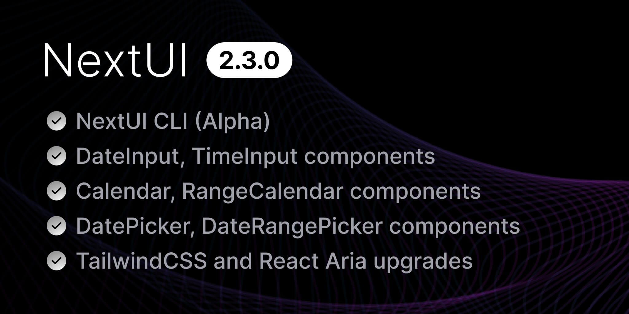
We are excited to announce the latest update to NextUI, version 2.3.0! This release introduces 6 new components, our new CLI, and several enhancements and bug fixes.
What's New in v2.3.0?
- NextUI CLI - A command-line interface for creating and managing NextUI projects.
- DateInput - Allows users to enter and edit date and time values using a keyboard.
- TimeInput - Allows users to enter and edit time values using a keyboard.
- Calendar - Displays a calendar for selecting dates and times.
- RangeCalendar - Displays a calendar for selecting date ranges.
- DatePicker - Allows users to select a date from a calendar.
- DateRangePicker - Allows users to select a date range from a calendar.
- Other Changes - Includes styling improvements, accessibility and usability enhancements.
Requirements:
- Tailwind CSS 3.4 or later
Upgrade today by running one of the following commands:
nextui upgrade
NextUI CLI
We are thrilled to introduce the NextUI CLI, a command-line interface, It offers a comprehensive suite
of commands to initialize, manage, and improve your NextUI projects. It enables you to add, remove, or
upgrade individual components, assess the health of your project, and more.
Installation
To install the CLI globally, execute one of the following commands in your terminal:
npm install nextui-cli -g
Alternatively, you can use the CLI without a global installation by employing npx:
npx nextui-cli@latest
Usage
Once the CLI is installed, run the following command to display available commands:
nextui
NextUI CLI can help you create new projects, add components, upgrade components, remove components, detect issues in you setup, know your environment, and more.
To initialize a new project, you can simply run:
nextui init my-nextui-app
You will be prompted to configure your project:
? Select a template › - Use arrow-keys. Return to submit.❯ AppA Next.js 13 with app directory template pre-configured with NextUI (v2) and Tailwind CSS.PagesA Next.js 13 with pages directory template pre-configured with NextUI (v2) and Tailwind CSS.
Select the template you want to use and the CLI will create a new project for you.
We're working on adding more templates to the CLI, so stay tuned for updates!
If you already have a NextUI project, you can add components to it using the add command:
nextui add date-input
It will automatically detect the required dependencies, modify your tailwind.config.(js|ts) file,
detect whether using pnpm if so, add the required configuration to your .npmrc file and add the component to your project.
If instead of installing a single component you want to install multiple components, you can do so by separating them with a space:
nextui add date-input time-input calendar
You can alternatively install the main package which includes all the components by passing the --all flag:
nextui add --all
The CLI is currentl in
Alphastage, we're working on adding more features and improvements. If you find any issues or have any suggestions, please let us know by opening an issue.
To learn more about the CLI and its commands, please refer to the CLI documentation and the CLI API reference.
New Components
Since the beginning of NextUI, devs have been asking for date and time input components. After months of iteration and development, we are excited to introduce the following new components:
DateInput
DateInput is a component that allows users to enter and edit date and time values using a keyboard. Each part of a date value is displayed in an individually editable segment.
Go to the DateInput documentation to learn more about the component.
TimeInput
The TimeInput component consists of a label, and a group of segments representing each unit of a time (e.g. hours, minutes, and seconds). Each segment is individually focusable and editable by the user, by typing or using the arrow keys to increment and decrement the value. This approach allows values to be formatted and parsed correctly regardless of the locale or time format, and offers an easy and error-free way to edit times using the keyboard.
Go to the TimeInput documentation to learn more about the component.
Calendar
A Calendar consists of a grouping element containing one or more date grids (e.g. months), and a previous and next button for navigating between date ranges. Each calendar grid consists of cells containing button elements that can be pressed and navigated to using the arrow keys to select a date.
The calendar also supports selecting years and months for rapid selection.
Go to the Calendar documentation to learn more about the component.
RangeCalendar
A Range calendar consists of a grouping element containing one or more date grids (e.g. months), and a previous and next button for navigating through time. Each calendar grid consists of cells containing button elements that can be pressed and navigated to using the arrow keys to select a date range. Once a start date is selected, the user can navigate to another date using the keyboard or by hovering over it, and clicking it or pressing the Enter key commits the selected date range.
Go to the RangeCalendar documentation to learn more about the component.
DatePicker
A Date Picker combines a DateInput and a Calendar popover to allow users to enter or select a date and time value.
Go to the DatePicker documentation to learn more about the component.
DateRangePicker
Date Range Picker combines two DateInputs and a RangeCalendar popover to allow users to enter or select a date and time range.
Go to the DateRangePicker documentation to learn more about the component.
Calendar Presets
Calendar and RangeCalendar components support adding custom content at the top and bottom of the calendar, this is useful for adding presets or
custom actions to the calendar.
Here's an example of how to add presets to the Calendar component:
Internationalization
These new components have built-in internationalization, time zones and granularity support, they supports selecting dates
in many calendar systems used around the world, including Gregorian, Hebrew, Indian, Islamic, Buddhist, and more.
Dates are automatically displayed in the appropriate calendar system for the user's locale this is possible thanks to @internationalized/date package, which
includes functions for parsing strings in multiple formats into ZonedDateTime objects.
Here's and example using the Indian calendar system:
Alternatively you can set the locale globally by using the NextUIProvider component:
// Next.js App Router example"use client";import {NextUIProvider} from "@nextui-org/react";export interface ProvidersProps {children: React.ReactNode;}export function Providers({children}: ProvidersProps) {const router = useRouter();return <NextUIProvider locale="hi-IN-u-ca-indian">{children}</NextUIProvider>;}
If no locale is provided, it will extract the locale from the browser.
NextUI Provider
The NextUIProvider component was updated to include the createCalendar function, which allows you to create a calendar instance with the specified locale and time zone,
and the defaultDates object which allows you to set global minimum and maximum dates for the components.
// Next.js App Router example"use client";import {NextUIProvider, SupportedCalendars} from "@nextui-org/react";import {CalendarDate, GregorianCalendar} from "@internationalized/date";export interface ProvidersProps {children: React.ReactNode;}function createCalendar(identifier: SupportedCalendars) {switch (identifier) {case "gregory":return new GregorianCalendar();default:throw new Error(`Unsupported calendar ${identifier}`);}}export function Providers({children}: ProvidersProps) {const router = useRouter();return (<NextUIProviderlocale="hi-IN-u-ca-indian"defaultDates={{minDate: new CalendarDate(1900, 1, 1),maxDate: new CalendarDate(2099, 12, 31),}}createCalendar={createCalendar}>{children}</NextUIProvider>);}
Breaking Changes
Removal of the units creation
To improve performance and reduce bundle size, we have removed the units creation from the
nextui plugin. TailwindCSS v3.4 added support for min-h-* and min-w-* classes, so it is no longer needed.
How to upgrade:
- Upgrade TailwindCSS to version 3.4 or later (if you haven't already). You can do this by running:
npm install tailwindcss@latest
- Remove the
spacingUnitconfiguration from yourtailwind.config.(js|ts)file (if you have it):
plugins: [nextui({layout: {spacingUnit: 4,},}),],
- Find all
-unitclasses in your project and replace them with a-separator. For example, replacep-unit-4withp-4.
import {Button} from "@nextui-org/react";export const MyButton = () => {return (<Button className="px-unit-2 py-unit-1 min-w-unit-48"><Button className="px-2 py-1 min-w-48">My Button</Button>);};
Separation for errorMessage and isInvalid
We are currently working on supporting multiple types of validation, including native HTML constraint validation, custom validation, and real-time validation.
Due to this reason, the requirements for displaying error messages have become more varied, and it is necessary to handle validation conditions separately from the errorMessage.
How to upgrade:
- To display
errorMessage,isInvalidmust be set totrue.
<Inputtype="email"label="Email"variant="bordered"defaultValue="junior2nextui.org"isInvalid={true}errorMessage="Please enter a valid email"className="max-w-xs"/>
That's it! Your project should now be using the latest version of TailwindCSS and NextUI.
Other Changes
Bug Fixes:
- Fixed an HSL color rounding issue in the theme settings to ensure accurate color representation. PR - @wingkwong
- Removed conflicting transition definitions affecting CSS classes. PR - @u3u
- Patched the "@nextui-org/autocomplete" package to fix an issue where empty items with
allowCustomValuewould not render properly due to a null node problem. PR - @wingkwong - Implemented a fix in modal components to prevent carryover of IME (Input Method Editor) input when switching fields using the Tab key. PR - @ryo-manba
- Enhanced accessibility by handling Tab key press event in the
ModalContentcomponent. PR - @ryo-manba - Fixed an issue where disabled select components could still be changed using blur and keyboard shortcuts. PR - @wingkwong
- Patched issues in "@nextui-org/use-aria-multiselect" and "@nextui-org/stories-utils" packages to fix a warning about
SELECT defaultSelectedKeys. PR - @wingkwong - Fixed an issue with incorrect
onChangetyping in Checkbox Group, ensuring it now correctly handles an array of strings as values. PR - @wingkwong - Fixed the
labelplacement issue inSelectcomponent if adescriptionprop is used PR - @novsource - Fixed the
originalPropsspread issue in theDropdowncomponent. PR - @wingkwong
Improvements
- Framer Motion was updated to the latest version, improving performance and reducing bundle size. Docs PR - @mezotv
LazyMotionwas added to all components that use Framer Motion, improving performance by only loading the required motion components.- We removed the custom
unitscreation from thenextuiplugin, it is no longer needed with TailwindCSS v3.4 and above. PR - @jrgarciadev - Updated
framer-motionpackage across various components and utilities to version11.0.22for enhanced performance and consistency. PR - @wingkwong - Ensured compatibility with
react@18.2.0andreact-dom@18.2.0across the board. PR - @wingkwong - Introduced patches for NextUI components to improve animations, including support for keyframes with spring and inertia animations. PR - @wingkwong
- Improved handling of numeric keys in the multi-select component to ensure consistent behavior. PR - @wingkwong
- Updated the version of react-aria to include the latest changes as detailed in the 2024-02-13 release. PR - @ryo-manba
- Added support for custom class names in the
AvatarGroupcomponent, enhancing flexibility in styling. PR - @wingkwong - Introduced a
countslot to theAvatarGroupfor more customized rendering. PR - @wingkwong - Improved the
AvatarGroupcomponent's count rendering logic for better performance and flexibility. PR - @wingkwong - Add RTL support to the kbd component. PR - @mrbadri
- Add RTL support to the Select component. PR - @mrbadri
- Add RTL support to the avatar group componen. PR - @mrbadri
- Add RTL support to the Table component. PR - @mrbadri
Documentation:
- Updated documentation to reflect the new features and changes in the
AvatarGroupcomponent. - Added support for the "bun" package manager across documentation and components. PR - @sudongyuer
- Kapa.ai widget was added to the documentation to provide AI support for users. PR - @wingkwong
- Layout docs updated to remove the
unitsconfiguration from thetailwind.config.(js|ts)file.
Special thanks to NextUI Team members @kuri-sun, @ryo-manba, @sudongyuer, @winchesHe, @wingkwong, @tianenpang, @smultar and contributors for their contributions to this release.
For a full list of changes, please refer to the release notes.
We hope you enjoy these new components and the new features. We're excited to see what you build with them!
Thanks for reading and happy coding! 🚀
Community
We're excited to see the community adopt NextUI, raise issues, and provide feedback. Whether it's a feature request, bug report, or a project to showcase, please get involved!
Contributing
PR's on NextUI are always welcome, please see our contribution guidelines to learn how you can contribute to this project.